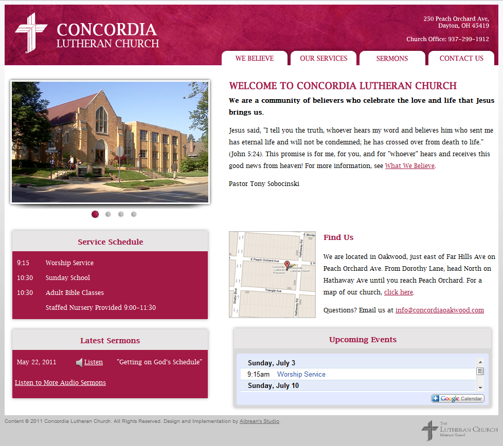
The old church website was primarily text-based with a simple header. The background was dark purple. The client wanted an updated look that was lighter. I kept with the same color scheme but used the purple color as an accent rather than the primary color. I used PHP includes so the client could easily edit the content such as header and footer and have it update site-wide. The client had the capabilities to update without having a CMS.
The logo design is not actually an official logo. The client did not have a logo so I used the LCMS cross and the name stacked in the same font as the rest of the site. The background on the header was in part from a texture that I changed hue on in Photoshop.
