Yea, just direct me elsewhere…

So I heard on the radio station that they arrested people connected to a possible terrorist attack on Jewish synagogues this morning. I head to the DDN site to get more information. There wasn’t anything on the front page. I went to CNN and looked and it was number one at the top. I twittered the DDN and they replied to me

We generally concentrate on local news because national news is available in so many places like CNN.

So…they want us to not use their website for news then. Hmm. Isn’t that sending the wrong message on being a newspaper. I mean yea it says “Dayton Daily”, but the fact that they have the Swine flu up there and there aren’t any local cases in Dayton. The UAW talks with GM are on the frontpage (GM in DETROIT mind you!). I replied,

So if there was another 9/11 it wouldn’t be important enough for the front page?

Here’s the thing – it has the potential to become local. Look how much 9/11 affected our everyday lives. Jewish synagogues were being targeted, maybe the local Jewish population should be made aware in case of a “copycat” terrorist.

That is why the CNN article has this:

“The targeting of any house of prayer in the United States is a threat to all religious groups and all religious leaders have an obligation to speak out publicly against this planned outrage,” said a statement from the Simon Wiesenthal Center, a Jewish human rights group.

The group urged all Jewish institutions to tighten security at their facilities.

Maybe I watch too much TV…but really. The point of the matter is, if I want “local news” I should go to the DDN site. If I want “national news” I shouldn’t give DDN the traffic, I should go to CNN. DDN doesn’t want to be the first source for news. Why on earth not? What company would direct traffic to a “competitor”?

Font Goodness! Polaris and Dripple Fonts


http://fontstruct.fontshop.com/fontstructors/aibrean

Created by myself 🙂

You may download and/or share this font but you must credit me. You may not use this for commercial purposes without proving me a license fee ($10). Derivatives are not allowed.

I Caught This! Adventures in Proofing

I didn’t design this site, nor was I involved in its development whatsoever. I did happen to notice several issues that shouldn’t be there given the nature of the site (design college). These are pretty simple mistakes and simple catches.

Download the PDF with comments

So starting from top left to bottom right: The first thing I noticed was that Chance’s name had a space before it so it wasn’t flush with the title below. It should all be flush left. The second thing I noticed was that the majority of the “// read more” links had a space after the hashes, the alumni and instructor featured area did not have a space after the hashes. Thirdly, under “events”, the more is all in caps, but everything else is not in caps. The fourth thing I caught (and this is something to consider when writing – make a style guide) is that “command g” was formatted three different ways. The last thing is that the “click here” call to action was not formatted as an obvious link. It was not in another color nor did it have hashes.

It’s very important to proof work, especially if it’s going live, and especially if it’s a design college. What do they teach their students? Well I turned out all right!

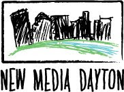
New Media Dayton logo

I whipped this up after doing a series of sketches. The initial sketches I imagined doing a city scape with the river below it. The sketch was very rough and it just didn’t feel right and the words didn’t blend well.

I thought about making the illustration blockier.


Then I thought about using the initials as part of the “grass and trees” of the city and using the negative space below as the river.

This is the new New Media Dayton logo (as seen in the LinkedIn group):