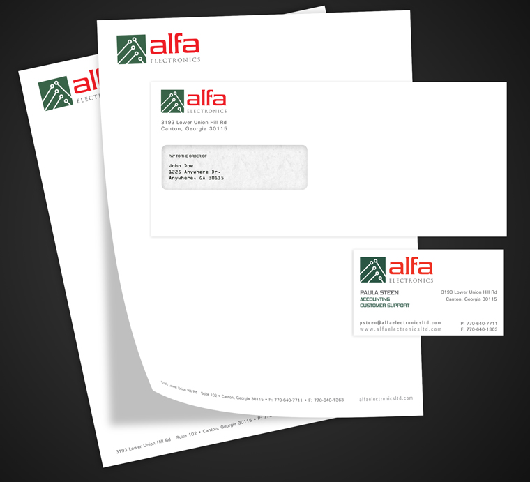
The old logo was dated and didn’t match the style of their website. Even in the consulting phase it was stressed to me that the client would like a script font. I explained why a script font would not be appropriate for their industry and they were open to change.
I was inspired by circuit board design and use the elements in a board to create an abstract letter “a”. Since there is a heavy Italian influence within the company, I chose a subdued green and bold red.

The letterhead and business card designs were minimal. While I had concepts with watermarks and such, the client wanted something simpler. When printing was needed, I expanded with an envelope and label design to match.